- 05 Sep 2024
- 6 Minutes to read
- Print
- DarkLight
Applying Custom Branding to the Secure Edge Portal
- Updated on 05 Sep 2024
- 6 Minutes to read
- Print
- DarkLight
In this chapter, learn how to customize your organization’s Secure Edge Portal account to match your company’s branding standards, including:
- Logos
- Background image
- Favicon
- Sidebar theme
- Primary color
- Text color
- Privacy policy
- From email address
- Fonts
Customizable Branding Components in the Secure Edge Portal
You can choose to customize all or selected branding components in your Secure Edge Portal account. Table 5 lists the components that you can customize.
Table 5. Customizable Branding Components
| Name | Description | Format | Size | Tips |
|---|---|---|---|---|
Dark Logo URL | A dark logo image to use in screens with light background, such as:
| SVG (recommended), PNG, and JPG. Your browser may support additional image formats. | Recommended size is between 90 x 30 pixels and 180 x 60 pixels. Images not in this range are scaled to keep the aspect ratio 3:1. Image background should be transparent. | It’s best to specify both dark and light logos. If only one is specified, it’s used on all screens. |
Light Logo URL | A light logo image to use in screens with dark background, such as the left menu bar in all screens. | SVG (recommended), PNG, and JPG. Your browser may support additional image formats. | Recommended size is between 60 x 20 pixels and 120 x 40 pixels. Images not in this range are scaled to keep the aspect ratio 3:1. Image background should be transparent. | It’s best to specify both dark and light logos. If only one is specified, it’s used on all screens. |
Favorite Icon URL | An icon to use when the left menu is collapsed. The browser uses it in tabs and bookmarks. | ICO (recommended), PNG, and GIF. Your browser may support additional image formats. | Recommended size is between 32 x 32 pixels and 40 x 40 pixels. Images not in this range are scaled to keep the aspect ratio 1:1. Image background should be transparent. | If you don’t specify this field, the dark logo is used. If no dark logo is specified, light logo is used. |
Login Background URL | Images to use as login screen backgrounds. | SVG (recommended), PNG, and JPG. Your browser may support additional image formats. | Image is sized to cover the entire login screen background. | You can specify up to four images. If you specify more than one, they are used randomly. If you don’t specify an image, the default is a gray background. |
Privacy Policy URL | The privacy policy URL to use in the login page cookie banner. | NA | NA | If you don’t specify the privacy policy URL, the default View Secure Edge privacy policy URL is used. |
Left Menu Color Theme | Select the color theme for the left menu | NA | NA | Default is dark. |
Primary Color | The primary color for key user interface elements such as:
| NA | NA | Default is #ec6000. Primary Color applies only to primary action buttons such as OK, Yes, and Save. Secondary action buttons such as Cancel, No, and Close will be white. |
Text Color | The text color for elements such as:
| NA | NA | Default is #555555. Text Color applies only to secondary action buttons such as Cancel, No, and Close. Text color of primary action buttons such as OK, Yes, and Save will be white. If the color theme of the left menu is dark, the menu labels will be white. |
From Email Address | The email address used for all emails that Secure Edge Portal sends you, including:
| NA | NA | Default is [email protected] |
Font Family URL | The URL of the font family to use (currently Google Font only) for key user interface elements such as:
| NA | NA | If you don't specify this field, your browser will pick the first available font in the Secure Edge Portal font stack. Your font family setting does not apply to the documentation page, service logs, legends, and mouse over text displayed for menu, button, etc. |
Applying Custom Branding
In this section, learn to apply custom branding to the Secure Edge Portal account for your organization. Once you have configure custom branding for your organization, you can apply that branding automatically to your child organizations; see Child Organization Branding Inheritance for more details.
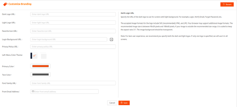
Before you start, make sure you understand the details you’ll need for each component that you’ll want to customize, described in Table 5 Customizable Branding Components. Follow these steps to specify your preferences for your customization. Skip the steps for components you don’t want to customize.
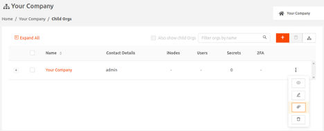
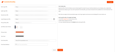
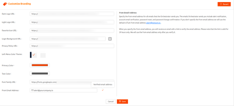
- From Secure Edge Portal left menu, select Orgs, then select Customize Branding from the three-vertical-dot icon to display the Customize Branding page.


- On the Customize Branding page, supply URLs for the image files for logos (Dark Logo URL and Light Logo URL), a favorite logo for collapsed menu (Favorite Icon URL), and login background (Login Background URL). When you select a text-entry field, the help content displays with image format requirements and best practice tips. See detailed format requirements in Table 5 Customizable Branding Components.
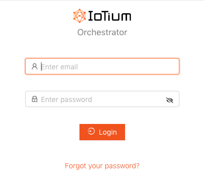
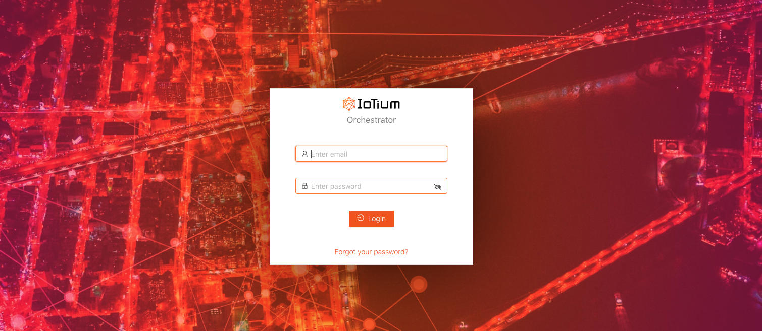
Specify:- Dark Logo URL — A dark logo to use on screens with light background, including, for example, Verify Email, and Forgot Password, and, as below, the Login box.

- Light Logo URL — A light logo to use on screens with dark background, such as the left menu bar in all screens. See the example logo in the the left navigation bar:

- Favorite Logo URL — A favorite icon to use in collapsed left menu (see example below). The browser uses the icon in tabs and bookmarks.

- Login Background URL — Login background(s). You can specify up to four. If you specify more than one, the system picks one randomly from the specified images.

- Dark Logo URL — A dark logo to use on screens with light background, including, for example, Verify Email, and Forgot Password, and, as below, the Login box.
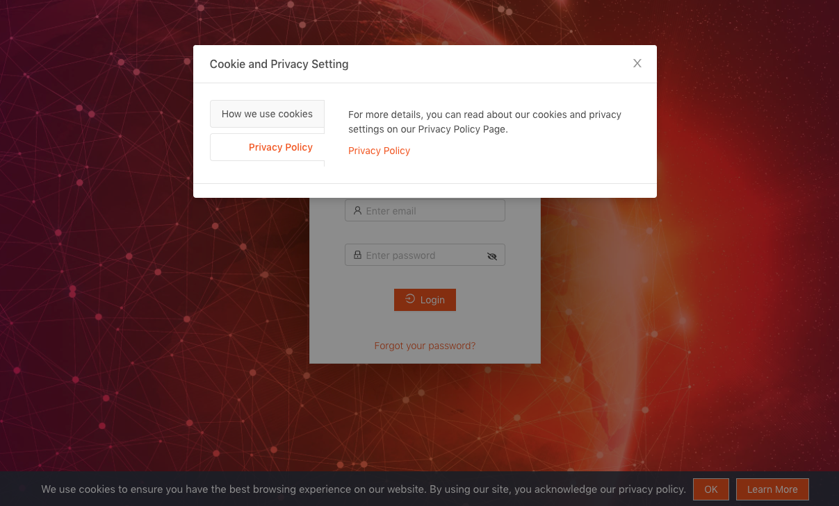
- Enter the URL for your company’s privacy policy in Privacy Policy URL. If you don’t specify a URL for the policy, the default is the View Secure Edge privacy policy URL.

The privacy policy is accessed through the Secure Edge Portal login page cookie banner in the Learn More > Cookie and Privacy Setting > Privacy Policy dialog box.
- Select colors in Left Menu Color, Primary Color, and Text Color. Following are examples of how the colors are used:
- Left Menu Color Theme — The color for the left navigation menu

- Primary Color — The color for key user interface elements, for example, the Save button. Note that secondary action buttons (Cancel, No, and Close) are white.

- Text Color — The color for most text, including menu, labels, input box. Text color for primary action buttons (OK, Yes, and Save) is always white. Following is an example of text color:

- Left Menu Color Theme — The color for the left navigation menu
- To customize the font used in headings, menu and widget labels, input boxes, tooltips, tags, etc., start by visiting fonts.google.com. Select a font and a style for your font. Go to the Embed section, copy the URL, and paste it into the Font Family URL field.

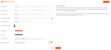
- Enter the From Email Address you’d like used on emails sent from the Secure Edge Portal. These emails include alert notification, account email verification, password reset, and password change confirmation. If you don’t specify the From email address we use the default, [email protected].

- Select Save to complete your customization.
If you customized the From Email Address, we send an email to that address requesting that you follow the enclosed link to verify ownership of the address. If you don’t verify the email address within 24 hours of when we send the request, you’ll have to request another verification link by selecting Verify on the Customize Branding page.
Once the From Email Address has been verified, the Customize Branding page shows the field as verified. After verification, we use the From Email Address.
Removing Custom Branding
To remove custom branding, follow these steps:
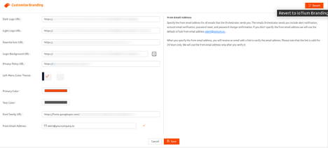
- On the Customize Branding page, select Revert.

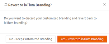
A confirmation dialog displays for you to confirm your request.
- Select Yes - Revert to ioTium Branding to confirm your choice.


